national museum of the pacific war
ui and ux design
Project Overview
Down in Fredericksburg, Texas, the National Museum of the Pacific War was creating a new interactive trivia game about life during the late 1940s and early 1950s. Working with BPI (Boston Productions Inc.) I led the visual design for this vintage-inspired trivia game.
My Role in the Project
For this interactive project I was the lead designer working directly for BPI, a creative multimedia company.

Looking Back
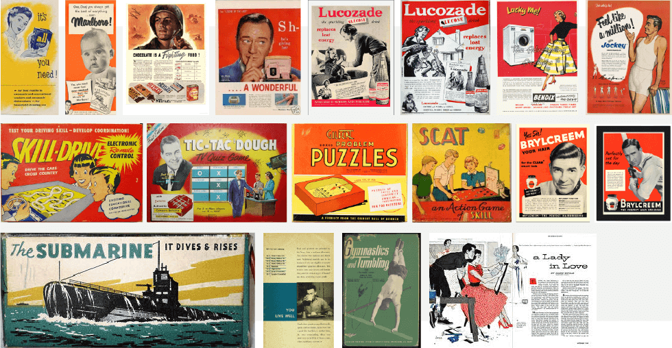
I based the design on print materials of the era that ranged from advertisements, military brochures, board game packaging, and extensive research of the printing technology of the time. I even found archives of printed military assets in my research.
Several observations informed my initial exploration and final design. Most printed materials at the time heavily used the three primary colors, even in photography. Products targeted towards children tended to use illustrations over photography. My research into these materials and processes informed my use of color, type, and visual elements for each concept of this project.

The Printed Age Made Digital
I ended up with three distinct concepts based on the printed materials of the time, each focusing on different target audiences. The first concept was based on package designs of board games, as well as smaller elements from game shows. The source of inspiration was all targeted towards fun and entertainment, a large part of the creation of this museum interactive. The second concept was based on external-facing military print pieces. Because of its more serious target audience, the design is less focused on color and illustration and more focused on photography and information. I introduced more dynamic elements to the layouts than the original materials to make them more playful and attractive to visitors. The final concept was based on a wide range of printed ads and publications, trying to just capture the zeitgeist of the 40s and 50s. Each concept uniquely and recognizably highlights different aspects of the era.
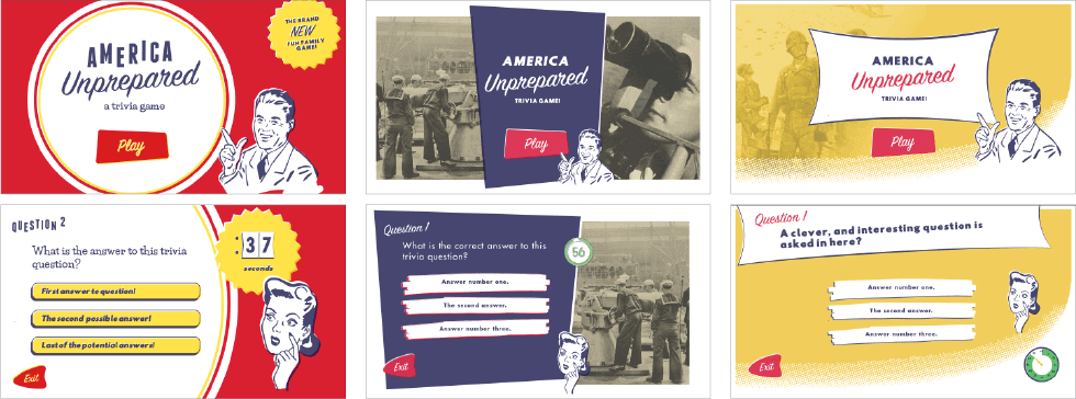
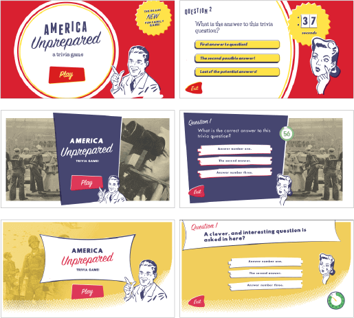
Digital Board Games
The client and I agreed that the board game concept best fit the target audience and desired effect. The intro screen imitates a board game lid with a "brand new" badge at the top right corner. Because of the digital nature of this interactive, I needed to mary digital and analog movement. I wanted the motion to feel authentic and so I studied old videos of early game shows. I paid special attention to the variety of ways information was revealed with the analog technology of the time. They flipped cards, spun boxes, slid papers, and lit up boxes. The final motion design was inspired by an old game show (Concentration) that used sliding boards to reveal and hide information.
This particular job was a dream to work on. Visiting museums is one of my favorite ways to pass the time, I try to visit one a month. And I also ADORE vintage design. I love looking at it, studying it, and in this case, imitating it.