Asher Biotherapeutics
Branding, webdesign, animation
Client Overview
Asher Biotherapeutics (Asher Bio) focuses on immunotherapies that target cancer cells more effectively to reduce unwanted side effects of cancer treatment. Asher Bio’s name comes from the Hebrew name of the first son of Jacob, which means blessed and happy. This California-based biotech company wanted to portray themselves as a serious company focused on “restoring hope and happiness to patients”.
My Role in the Project
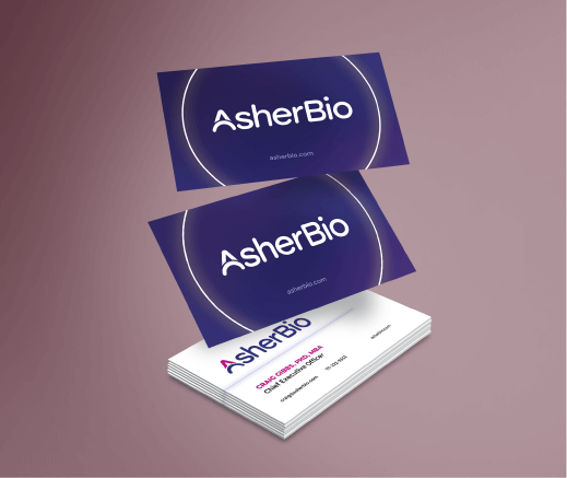
My role in this rebrand was that of art direction and graphic design. I worked directly for The Yates Network, a strategic communications and public relations group for biotech companies, and SAC Designs, an animation and design agency.


Focusing on Why
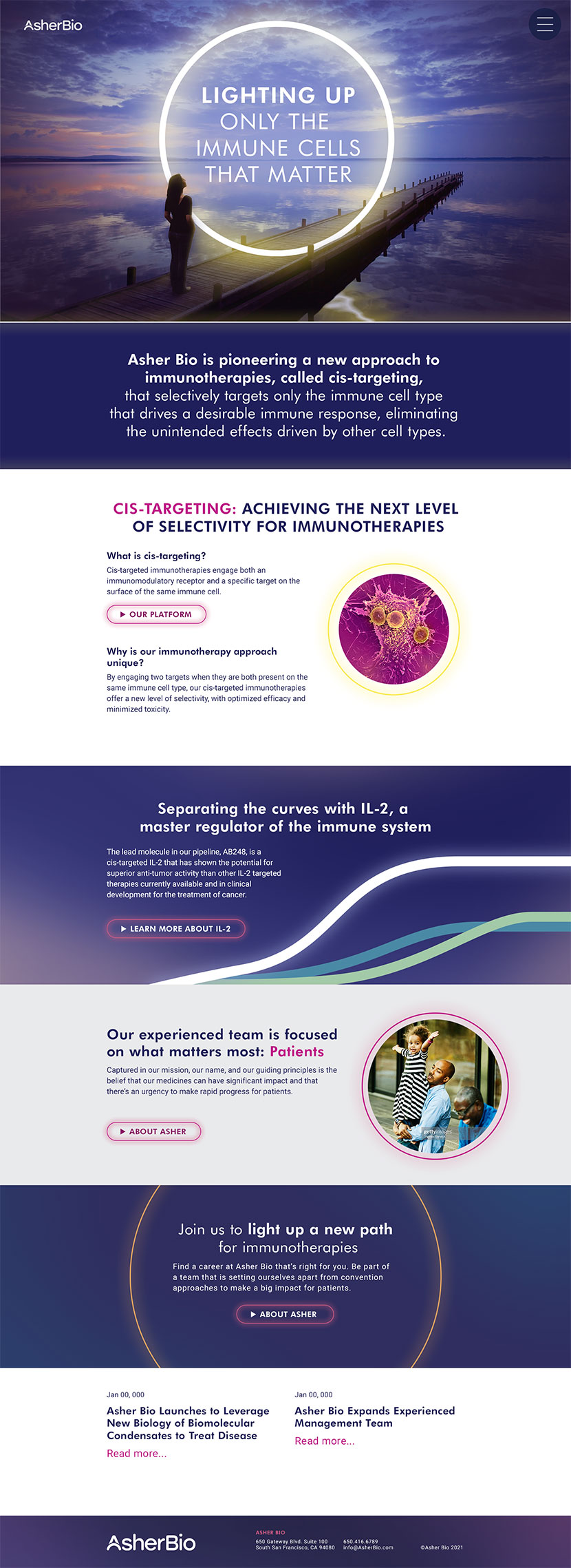
Asher Bio wanted to instill hope through a patient-focused brand. Rather than focus on the what: their science, they wanted to focus on the why: the patients. The primary inspiration for the visuals was their tagline “lighting up only the immune cells that matter”.
The Ring of Hope
The ring of hope uniquely sets their photography-based brand apart. It is at once a visual manifestation of their tagline, and a metaphor. The ring is a symbol of unity, completion, hope, a spotlight, and, in science, a cell. Within patient photography, it spotlights the strong patient journey inside the halo of hope that AsherBio provides. It spotlights positivity in their team photography and the inspirational optimism of the majestic landscape photography.

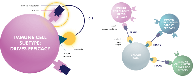
Going Back to the Science
A large part of branding a biotech company is their science. We needed to create a visual language for their data that would inform how that data would be communicated to non-technical shareholders. As part of establishing their visual language, I worked with the talented scientific writers from The Yates Network and the science team from Asher Bio to create the simplest, most accurate portrayal of their densely complicated information. Science has always been a passion of mine and translating difficult to understand information through legible design is one of the most satisfying parts of my job. For this job, I created their main scientific illustrations and charts as well as a short animation for their website.
The End Result
In the end, we developed a brand that encapsulates the aspirations and personality of Asher Bio simply and uniquely. A brand that the entire Asher team was proud of. The team was so happy they sent me a gift box of rosé and teas.
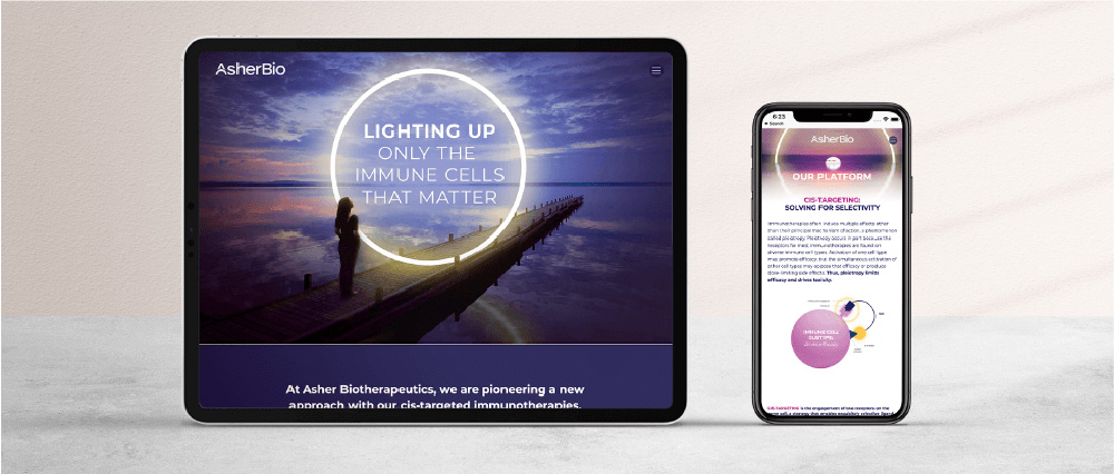
The team at Asher Bio and representatives of Third Rock Ventures fell in love with their new identity and felt confident they would stand out in the immunology space of the biotech world. Visit the website to see their brand in action.