passion project
branding
Rebranding a Legend
Rebranding Wayne Enterprises was no small task. It took hundreds of sketches and planning. The aim of the rebrand was to create a logo that was strong and simple enough to represent the empire that is Wayne Enterprises, but also flexible enough to be reinterpreted to all of its sub-brands as Wayne Enterprises has over 30 child companies.
The Story Behind the Logo

The circle encompasses the global reach of Wayne. Being one of the largest international conglomerates is an integral part of who the company is.

The darkness of the circle is representative of Gotham City's enveloping corruption, which the CEO of Wayne Enterprises is so -keen- on addressing.

The triangle is reminiscent of a beam of light. Light is a symbol of hope, truth, enlightenment, optimism, and innovation; all things that truly describe the core of who Wayne Enterprises is and stands for.

The modern, sharp, sans-serif white W is symbolic of the company’s current movement into the modern era. Its sharpness is symbolic of innovation. Its bright white color shining from the darkness is symbolic of Wayne always being a symbol of purity in an ever-corrupting society.
Sub-brands

It was important in the creation of sub-brand logos to be able to show a variety in tone to appropriately match the brand. Wayne Enterprises does everything from flying first-class passengers across the world to building warships to growing apples. The logo of Wayne Airlines should not have the same feel as Wayne Foods. I created logos for five sub-brands of Wayne Enterprises to show the potential diversity in tone the Wayne logo could handle.
While being very adaptable, the logo is still able to remain recognizable. All sub-brand logos must maintain the same circle and W and only replace the triangle with a simple and recognizable mark that fits 90% inside the area of the golden triangle.

The Process
Wayne Enterprises was a challenge. Create a brand that is powerful enough for a strong billionaire philanthropist CEO and his multi-billion dollar multinational conglomerate, but have a logo that can be soft enough to work for their grocery store or children’s clothing store. I found several times that I’d come up with a logo that was elegant for Wayne Enterprises alone, but not for half of its child companies. It took several failures and half successes with glimmers of hope that eventually inspired what is the final product.
The rebrand was specifically for Wayne Enterprises, the conglomerate where Bruce Wayne is king, not any of its child companies. Those would have their own branding to suit their clients and business models. A navy steel manufacturing plant is not created equal to an entertainment company. Part of the rebranding includes the template for designing all future and current Wayne child companies. It was a difficult and incredibly rewarding journey.
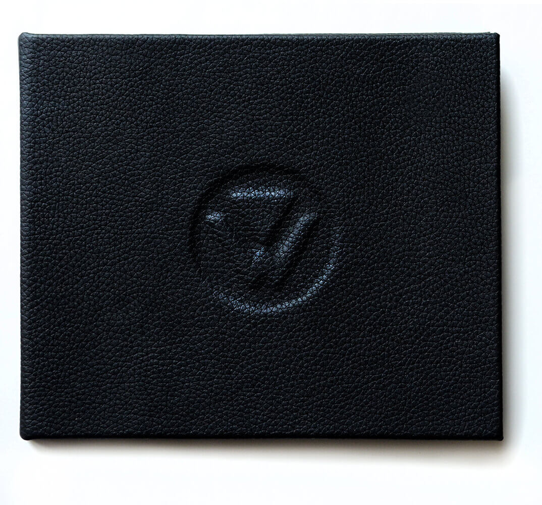
What self-respecting international conglomerate would be complete without a leather-bound monogrammed brand guidelines? Definitely not this Batman's cover day job. Hand-bound and full of beautiful details.